Contributed by: Michael Brill
Lately I’ve noticed a presence that has accompanied me from room to room, fluttering over the pages I read and landing on a surprising number of them. This presence is the blue morpho, a large butterfly (8-inch wingspan) that inhabits Central and South America and is celebrated for its beautiful electric-blue color. That color is structural: it is caused by the interaction of incident light with the shape of a light-receiving surface, not by wavelength-dependent light absorption by that surface.
I first encountered the blue morpho in Kai Kupferschmidt’s book, Blue: In Search of Nature’s Rarest Color, which I reviewed in Issue 504 of ISCC News. There I learned about a tricky problem that the butterfly appears to have solved through natural selection. Interference patterns can lead to brilliant structural colors, but the color you see generally depends on the angles of illumination and viewing. As the viewing geometry changes, it is difficult to preserve the color of the butterfly’s wing at all angles. Kupferschmidt notes that scientists have only recently understood the angle-independence of that color. The proof of their understanding was their effectiveness in imitating the butterfly’s color and is the subject of several U.S. patents (see U.S. Patent Nos. 11,428,854 and 11,200,583, and also Patent Application No. 20210018659). The inventor is none other than Andrew Parker, who gave one of the ISCC presentations on color and evolution last September, a month or so after I had encountered Kupferschmidt’s book.
Parker’s solution is a multi-layer composite of scales similar to the microscopic scales on the wings of the morpho butterfly. Normally, a set of nearly identical features with even spacing would cause an interference pattern. The trick inspired by the morpho butterfly is to add a constrained randomness in the orientation of the scales. Besides being randomly oriented, Parker’s scales are convex, and that convexity causes the incident light to diverge into a variety of directions, while keeping a sufficient intensity and wavelength selectivity to stay electric blue. This convexity seems to be the main mechanism of the solution: Parker designed his multi-layers so as to minimize the effects of interference in the light scatter. To this end, he forced the refractive index to have a smooth dependence on the layer, which encourages a ray-optic analysis. (This could be a big surprise to those of us who assume that iridescence is a natural and unavoidable result of a structural color – but remember Newton’s prism can serve as a light-dispersing element.) You have seen the ray-spreading behavior before, in the convex side mirrors on your car (“objects in mirror are closer than they appear”). When you look at this mirror’s reflection of a localized light source, it indeed seems farther away than a flat-mirror reflection. The source retains its intensity but occupies less visual angle and (in compensation) visibility in a wider range of scattering directions.
At about the same time I learned of Parker’s invention, I received my August issue of Optics and Photonics News, and there was our blue friend again, now in the context of “Radiative cooling in living color.” The research was done by Wanlin Wang et al. in Shenzhen University in China. The primary research publication is W. Wang et al., Cooling colors below ambient temperature, Optica10 (2023), 1059-1068.
As did Parker, the Chinese group claimed a blue-morpho-inspired composite layer that achieves the viewing-angle insensitive blue color. For angle diversity, they found that frosted glass provided a satisfactory solution. But the Chinese group simultaneously strove for a different objective. Their angle-constant blue layer also provides substantial radiative cooling – up to 2 degrees C lower than the ambient and better than using a white reflector. To achieve this cooling performance, they adjusted the spectral properties of the layer over all visible through mid-IR electromagnetic wavelengths. In particular, the absorbed part of the incident solar radiation heats the surface and converts the heat to black-body radiation with a mid-IR component that is much stronger than the passive cooling emission that would otherwise be present in mid-IR. It turns out that the Earth’s atmosphere is completely transparent to mid-IR radiation (8000 to 13000 nm). Because of that transparency, radiation in the mid-IR window promptly leaves the Earth and never returns. For us it might be a window of escape from global warming.
Having read about the Shenzhen group’s radiative-cooling layer, I tried to tie the design back to the morpho butterfly but found the analogy wanting. It seemed to me that their device comprised two independent inventions – one for angle-invariant color and one for radiative cooling – only the first of which pertains to structural colors and thereby to the blue morpho. The main emphasis of the Optica article was radiative cooling, which is not a property I’ve ever seen attributed to the blue morpho. How, then, can one convincingly assert that this research is related to the blue morpho?
The plausibility seems to hinge on the choice between two alternative words: “imitate” versus “inspire.” The Shenzhen group used both words to describe the connection. On one hand, they imitated the structure of the blue morpho’s wing (presumably in solving the color-versus-angle problem), but they were not imitating it anymore when they were solving the cooling problem. On the other hand, they could have been inspired by the blue morpho to do the entire project including the cooling problem. Unlike an object of imitation, an object of inspiration does not imply technical transfer to the project from the source of inspiration. Imitation is hard, as implied by Yogi Berra: “If you can’t imitate him, don’t copy him.” So, the blue morpho as inspiration is more inclusive (perhaps all-inclusive: anything can be inspired by anything else).
I tried to be tolerant of the looser connection implied by “inspired,” but ultimately its all-inclusiveness turned me off and I remained unswayed.
Suddenly, the butterflies that were fluttering around me disappeared.
The blue morpho is indeed a beautiful creature and a wonderful muse. It’s not often I see a single actor participating in so many shows at the same time. But the radiative-cooling show seems far-fetched for this actor. I question the relevance, other than to say that the blue morpho has a cool color.
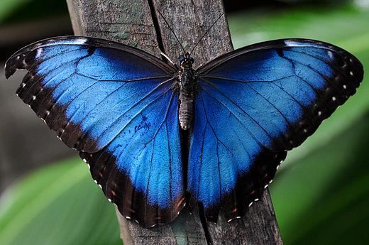
Figure 1. Blue Morpho, Female, Dorsal view.
Source: Wikipedia. Copyright
Michael Brill is the recently retired Director of Research at Datacolor in Lawrenceville, New Jersey. Since obtaining his Ph.D. in physics from Syracuse University, he has carried out extensive theoretical research on color in human and computer vision, in geometric/photometric invariance, and in physics-based vision. He received the 1996 ISCC Macbeth Award for work on color constancy and the 2010 ISCC Nickerson Service Award. Dr. Brill is a member of the International Advisory Board of Color Research and Application and until 2023 served as Vice Chair of ASTM Committee E12 on Color and Appearance.