Sharing KNOWLEDGE + EXPERIENCE about COLOR

  • Research 
  • Design/Arts 
  • Industry
  • Education

The Color Council (ISCC) is the principal interdisciplinary society in the United States dedicated to advancing color research and best practices in industry, design/arts and education.

Become a Member


Rochester Institute of Technology

June 16-18, 2025

Deadline for Proposals:
December 15, 2024

ISCC is soliciting presentation, poster, and short course proposals from color practitioners, researchers, students, and professionals on the topic of Color as Communication. Our theme probably includes some aspect of what you already do with color! Come share it with us, and learn about what others are doing as well.

Presentations may be technical or non-technical, papers are not required and 
proceedings will not be published.
Find out more HERE.


Upcoming Events

    • 06 Dec 2024
    • 11:00 AM - 12:30 PM
    • Virtual
    Register

    The Colour Literacy Forum is an international, collaborative effort to align university-level colour education with current design needs in the culture. The goal of the Forum is to connect faculty, students, and administrators with interdisciplinary professionals to provide cutting-edge research, curricula, tools, and resources.

    The Colour Literacy Forum is a virtual gathering featuring presentations and discussions related to updating and expanding colour education in art and design programs at the university level. The forum convenes for three events per year to share information and offer dynamic networking opportunities for participants.

    Register using the button at left. For complete details visit Colour Literacy Project.


    Lives in colour: Pioneering women in colour history

    We associate many milestones in colour history with men, for example Isaac Newton, George Field, Goethe, Chevreul, Itten, Kandinsky and many others. Examples of women writing about colour are rare before the 20th century. In this talk Alexandra Loske will introduce three women who wrote and published on colour and colour theory in the 19th and early 20th century and investigate what motivated them and how they claimed their place in the colour canon: English flower painter Mary Gartside (c.1755-1819), multi-cultural poet, actress and inventor Beatrice Irwin (1877-1956) and German artist and lecturer Carry van Biema (1881-1942), whose life and work were brutally extinguished by the Nazis during WW2.

    The Speaker

    Dr. Alexandra Loske is a British-German art historian, writer, and museum curator with a particular interest in late eighteenth and early nineteenth century European art and architecture. The subject of her doctoral thesis was the use of colour in the Royal Pavilion, a Georgian former royal residence in Brighton, East Sussex, where she is now curator. Alexandra has lectured and been published widely on the subject of colour. Her first book was Colour – A Visual History (Tate/ Smithsonian Institute, 2019). She is the editor of a volume on colour in the 19th century for The Bloomsbury Cultural History of Color. Her most recent publications are Mary Gartside: Abstract Visions of Colour (Paul Holberton, 2024), the substantial double-volume The Book of Colour Concepts (TASCHEN, 2024), and The Artist’s Palette (Thames & Hudson/Princeton University Press). In 2014 she curated the exhibition Regency Colour and Beyond 1785 – 1845 at the Royal Pavilion, and contributed to the exhibition Turner et la Couleur in Aix en-Provence and the Turner Contemporary in Margate. Her research into women in colour history is supported by the Centre for Life History and Life Writing Research at the University of Sussex, where she holds a Research Associate post. Currently, she is writing a book about the Royal Pavilion for Yale University Press and preparing a new exhibition on colour for the Royal Pavilion

    Blue jeans: an exercise in contrast

    Few clothing items are as ubiquitous as blue jeans, yet their simplicity is deceptive. For some, indigo blue might be the colour of freedom, but for workers who have produced the dye, it has often been a colour of oppression and tyranny. Levi Strauss made blue jeans in the 1870s to withstand the hard work of mining, but denim has since become the epitome of leisure. In the 1950s, celebrities like Marlon Brando transformed the utilitarian clothing of industrial labour into a glamorous statement of youthful rebellion, and now, you can find jeans on chic fashion runways. While the term “blue jeans” indicates a colourful essence, jeans have become so commonplace that most people don’t even register them as blue. Masculine and feminine; sexy and slouchy; durable and disposable—blue jeans are nothing if not an exercise in opposites. In this talk, Carolyn will consider the versatility of this iconic garment and investigate what makes denim a universal signifier, ready to fit any context, meaning, and body. She will also discuss why, when it comes to jeans, what was once the world’s most coveted colour has become practically invisible. Although blue jeans have been historically defined (at least in part) by their hue, the way consumers perceive denim’s colour has never been far from context.

    The Speaker

    Carolyn Purnell is a historian, writer, and lover of all things colourful. She is the author of Blue Jeans (2023) and The Sensational Past: How the Enlightenment Changed the Way We Use Our Senses (2017). Carolyn earned her Ph.D. in history from University of Chicago, and her work has appeared in publications including Psychology Today, Wall Street Journal, CityLab by The Atlantic, and Apartment Therapy. Her research has received recognition from the National Endowment for the Humanities, European Commission, Huntington Library, Georges Lurcy Foundation, Brown Foundation of Fellows, and French Society for Historical Studies. Most recently, Carolyn wrote and produced “Pasture Prime,” a short film that premiered at the 2024 Sundance Film Festival.

    “It’s a girl!” What pink reveals about colour, gender and childhood in the 20th and 21st century

    A growing number of expectant millennials decide to throw a gender reveal party by cutting open a cake to reveal either pink or blue filling, releasing pink or blue balloons or by staging a spectacular, at times deadly, pink, or blue explosion. But what exactly does pink and blue “reveal”?. An increasingly anticipatory and nostalgic, scientific, and sensory, commodified and community-sharing mode of affirming the gender binary. While all senses are implicated in affirming the gender of the not-yet-child during pregnancy, seeing either pink or blue has become particularly salient in establishing the “visual truth” of two and only two genders in the 21st century. Along with commodified prenatal gender testing, pink or blue baby showers, “gender-appropriate” nursery designs, colour coded toys, and pink or blue birth-announcements, all exhaustively documented on Instagram, gender reveal parties contribute to stereotyping, dramatizing, and celebrating “it’s a boy” or “it’s a girl” – in a rapidly changing landscape of gender identity. Indeed, it strikes the author as tantamount to articulate the celebration of the pink and blue binary in pregnancy and early childhood with the increasing visibility of gender nonconforming identities. Dominique will thus home in on the LGBTQ+ communities’ ambivalent relationship to Barbie, arguably the most stereotypically pink toy there is. Since her birth in 1959, Barbie has played a central role in LGBTQ+ coming-out narratives, culminating with the 2023 Barbie film and its excessively pink aesthetic. This goes to show that (the meaning of) colour or gender cannot be contained. For one thing, has Barbie always been pink? Has pink always been a girl’s colour?

    The Speaker

    Dr. Dominique Grisard (she/her) teaches gender studies at the University of Basel and heads the Swiss Center for Social Research (CSR). She is currently doing research on visual arts institutions while developing a “Gender and diversity monitoring in the Swiss cultural sector”, a research cooperation between CSR and Pro Helvetia at the University of Bern. Long-standing research interests are the gender history of color, most notably pink, childhood, consumption and popular culture, visual arts, femininity, whiteness, sexuality, intimacy, prisons and terrorism. Grisard is the author of Gendering Terror (Campus, 2011) and co-editor of five anthologies in gender studies, among them “Violent Times. Intersectional Gender Perspectives” (Seismo, 2022) and the forthcoming “The Life of Beauty” (Seismo, 2025). In addition, Grisard has published widely on the color pink.

    • 18 Dec 2024
    • 2:00 PM - 3:00 PM
    • virtual
    • 30
    Register

    Colorful Connections is an opportunity to gather informally with other members of ISCC for a little socializing, networking and learning from each other. Discussions are wide-ranging and depend on attendees, their current interests and past experience. Consider this the online version of coffee breaks and happy hours at a color conference. BYO coffee or beverage and join in the conversation! 

    Note that this is Members Only event. Not a member, no problem - Join here!

    • 14 Jan 2025
    • 2:00 PM - 3:00 PM
    • virtual
    Register

    Andrew Reach: Color is Life

    My art is one of a perspective that is built of layers upon layers of inspiration, meaning, and life experiences. Color is a strong part of my life experience. Growing up in Miami, the tropical colors, from the hedge in my backyard of deep pink Hibiscus flowers to the azure blues of the Atlantic Ocean, to the coral reefs I scuba dove in the Florida Keys, the saturated colors seeped into me and never left.

    My love of geometry and the art deco buildings in Miami were a strong pull on me and I knew by the time I was in my early teens, what I wanted to be; an architect. In my architecture studies, color was merely cursory, having been exposed to Joseph Albers from the Bauhaus and his book ‘Interaction of Color’. I would go on to use color in my architecture practice, somewhat limited on building exteriors and more on interiors projects I designed for offices for advertising agencies and film production companies. But the pursuit of color in these endeavors was limited in scope as opposed to a visual artist with freedom to explore more dynamic and expansive palettes. This would change when a spine disease and disability made the rigors of the profession untenable.

    Andrew provided a detailed and fascinating extended abstract available here.

    Bio:

    From my early childhood in Miami, Florida, the tropical colors and shapes of the built environment resonated strongly, and I began to aspire to make my mark on the world around me. From the hedge in my backyard of deep pink Hibiscus flowers to the azure blues of the Atlantic Ocean, to the coral reefs I scuba dove in the Florida Keys, the saturated colors growing up in Miami seeped into me and never left. The tropical colors and shapes around me in the built environment resonated strongly – in particularly the shapes of the art deco buildings in Miami Beach. It became clear to me by the time I was a teenager that my calling would be architecture, where I could put my love for geometry into practice. And it would come to pass that geometry and color would play the central role in my creative process as a visual artist as well.

    After earning a Bachelor of Design from the University of Florida and Bachelor of Architecture from Pratt Institute, I pursued my passion of becoming an architect. I went on to work in Los Angeles for 11 years on homes, offices and historic preservation and returned to Miami to work for the international architecture firm HOK on large scale projects, fulfilling my yearning to contribute to the built environment of my hometown. My role as project architect of the Frost Art Museum at Florida International University in Miami was one of the most meaningful, especially as it was the last project I worked on before a spine disease made the rigors of the profession untenable. If you would have asked me while working on the museum that I would return to it in a solo exhibition, FULL CIRCLE, I would have said that’s crazy, as my reinvention as an artist was yet untold.

    Kneaded into these layers is my journey of healing. Beginning in early adolescence, I developed Scheuermann's disease, a curvature of the spine that continued to progress into adulthood and if left untreated, the continuing curvature would crush my internal organs. I began making art digitally after my second surgery in 2004, originally at the urging of my husband as a way of escaping from pain. I had no idea at the time that this initial foray into art making would become my new path forward in life.

    I developed lengthy complications which forced me into long stretches of immobility. Though difficult, this stationary time allowed me to tap into my love of geometry and saturated tropical color palettes I grew up with in Miami and funnel my creative inspiration down a new path: artmaking. I turned to making drawings with digital tools as my escape hatch from pain. Pain became inspiration; Fuel for a fire.

    Now, a resident of Cleveland for 17 years with my husband Bruce (together now 43 years), I feel connected to the cultural richness of the region, with creative talent that inspires me every day. I find my architectural roots pulsating stronger than every which I’m channeling in new creative avenues, most notably, using 3D virtual modeling in my quest to explore my passion of geometric form making while infusing these forms with vivid color. My work evolves swiftly, yet somehow time travels between the layers of my life as a thinker using imagination to channel the physical to the spiritual, and rushes forcibly into my foundational curiosity in seeking meaning out of the human condition.

    My work has been exhibited in the United States in solo and group exhibitions. I feel it a privilege to have my work in private, corporate and institutional collections among them the Permanent Collection of the Frost Art Museum, University Hospitals Art Collection, Summa Health Healing Arts Collection and the Cleveland Clinic Art Collection. My work in public art includes a permanent installation at the LGBT Community Center of Greater Cleveland, a 10 x 30 foot art wall for the Cleveland Public Library’s “SEE ALSO” public art initiative and most recently, in progress a 30 foot long 3d wall artwork for Case Western Reserve University’s School of Medicine Dental Clinic on Cleveland Clinic’s Education Campus.  


 NEWS!

Deadlines for our new Student Support Grant are May 15 and October 15, 2024! This grant is designed to assist undergraduate and graduate students with activities pertaining to colorDetails and application forms here.


Grow your color knowledge

Learn and connect with color professionals through our events, resources, and programs!


The Colour Literacy Project is an educational initiative to strengthen the bridge between art and science in 21st century colour education.

This project provides foundational, state-of-the-art resource within a STEAM framework. Teaching guides available for free download.

VISIT COLORLITERACY.ORG


Join students from all disciplines and network with color professionals. Discover state-of-the-art information about color in our lives and applications in the world. New episode every month. One-hour presentation on topics such as branding, architecture, paint, and more.

MORE ABOUT FLUORESCENT FRIDAYS


Consider this the online version of coffee breaks and happy hours at a color conference. BYO coffee or beverage and join in the conversation!

Socialize, network, and learn! Discussions are wide-ranging and depend on attendees, their current interests and past experience.

REGISTER FOR THE NEXT ONE


A deeper dive into a range of topics related to color. 

BOLD: Color from Test Tube to Textile

Presented by Dr Elisabeth Berry Drago, Director of Visitor Engagement at the Science History Institute. Recorded January 23, 2024.


We are sharing this webinar to non-members for free. Visit this link and enter your name and email address. 


A Look Inside Our Quarterly:

Join the Color Council to receive the entire publication!


Diffusion Material for Luminous Mosaic Images

In this editorial, Richard Travis presents a follow-up to his 2021 pair of articles about color education and additive color mixing, which also serves to remind us all to have a look at both of his preceding works.

Read more>>


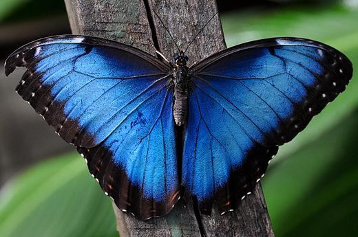
Blue Morphos Have a Cool Color

I first encountered the blue morpho in Kai Kupferschmidt’s book, Blue: In Search of Nature’s Rarest Color, which I reviewed in Issue 504 of ISCC News. There I learned about a tricky problem that the butterfly appears to have solved through natural selection. Interference patterns can lead to brilliant structural colors, but the color you see generally depends on the angles of illumination and viewing.

Read more>>

Subscribe to our mailing list

Receive our Quarterly Newsletter on the art and science of color, group events, and more.

Subscribe

COPYRIGHT © INTER-SOCIETY COLOR COUNCIL  | SITEMAP

Powered by Wild Apricot Membership Software